
Learn the difference between Dropdown and Pills selector styles, where selector styling applies, how existing stores are affected, and how to configure and preview the preferred style before publishing.
Existing stores continue using Dropdown unless the Product Details element is manually changed to Pills. Enabling or updating this feature does not automatically convert existing stores to Pills.
What is Product Selector Styling?
Product selector styling controls how selectable product options appear on a Product Details Page. Choosing the right layout can make options easier to scan, keep complex product pages more compact, and help customers understand which configuration they are purchasing.
| Style | How It Displays |
|---|---|
| Dropdown | Displays available choices inside a compact dropdown menu. |
| Pills | Displays available choices as selectable button-style options directly on the page. |
Key Benefits of Product Selector Styling
Selector styling gives you more control over how customers interact with configurable products. A layout that matches the number and type of options you sell can improve clarity without requiring changes to the underlying product configuration.
- Improved Option Visibility: Pills expose available choices directly on the page so customers can scan options faster.
- Compact Layout Options: Dropdown keeps larger option sets contained in a smaller amount of page space.
- Consistent Storefront Styling: Variants, quantity controls, supported upsell selections, and multi-price selectors can follow a more unified visual pattern.
- Mobile-Friendly Experience: Selector behavior is designed to work across desktop and mobile storefronts.
- Design Flexibility: Choose the selector layout that best matches the product and storefront design.
- Preview Before Publishing: Review selector behavior in the builder and preview experience before making changes live.
Where Product Selector Styles Apply
Selector styling affects more than the visual treatment of a single variant field. Understanding which product controls follow the selected style helps you preview the full Product Details Page before publishing.
| Product Control | Behavior |
|---|---|
| Variants | Can display using Dropdown or Pills. |
| Multi-Price Selectors | Follow the same Dropdown or Pills configuration used by variant selectors. |
| Quantity Controls | Quantity color customization is available when Pills is selected. |
| Supported Upsell Selections | Selector styling is designed to create a more consistent storefront experience across supported product-selection controls. |
Dropdown vs. Pills Selector Styles
Dropdown and Pills are designed for different storefront needs. The best choice depends on how many options the product has, how much page space you want to use, and whether customers benefit from seeing all choices at once.
Dropdown
Dropdown places options inside a menu, keeping the Product Details Page compact even when a product has several choices.
- Products with many variant options
- Compact product-page layouts
- Stores that prefer a traditional selection experience
- Existing stores that want to retain the default selector behavior
Pills
Pills display options as selectable buttons directly on the page. This gives customers an immediate view of the available choices and supports visual selected and unselected states.
- Products with fewer variant options
- Stores that want a more visual selection experience
- Pages where option discoverability is important
- Merchants who want to customize selected and unselected color states
Selection behavior: Pills support one selection within each variant group. For example, a shopper can select one size from the Size group and one color from the Color group.
How To Set Up Product Selector Styles
Configuring the selector style from the Product Details element ensures the storefront uses the intended layout for product choices. Previewing the page before publishing is especially important when switching an existing store from Dropdown to Pills.
Open the store that contains the Product Details Page you want to customize.
Open the Product Details Page in the builder. If the store uses a custom Product Details Page for the affected product, open the appropriate custom page instead.
Click the Product Details or Product element that controls the product information and selector settings on the page.
In the element's General settings, locate the Variants styling controls.
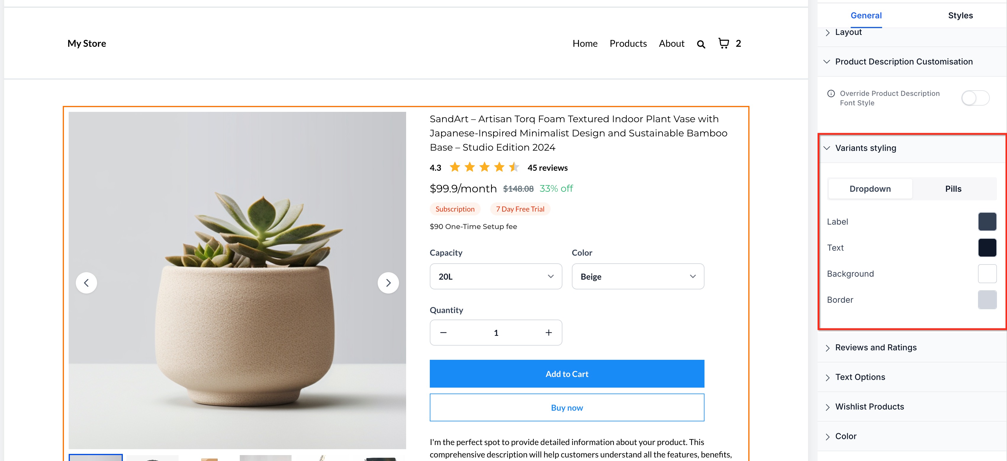
Select the layout that best fits the product and page design. Use Dropdown for a compact selector or Pills when you want available choices displayed directly on the page.
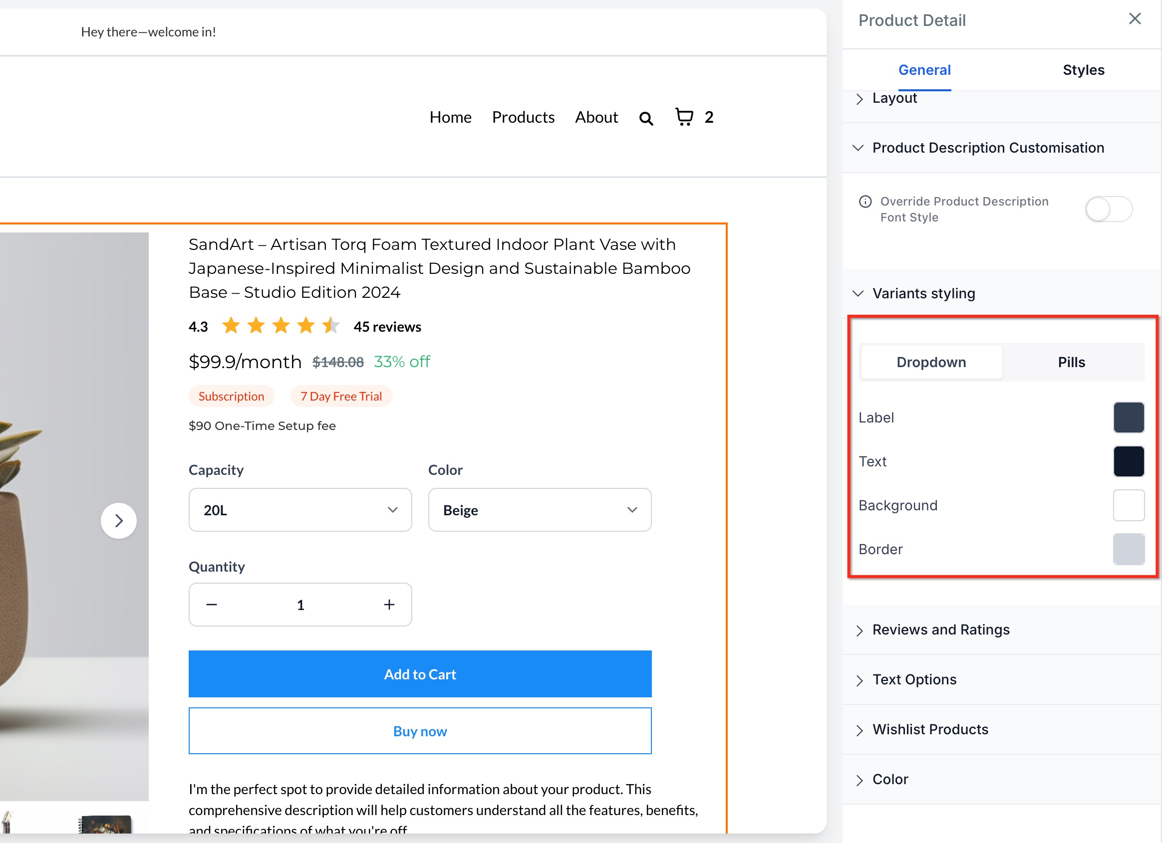
Dropdown Example
Dropdown keeps product options inside a traditional selection menu and remains the default format for existing stores.
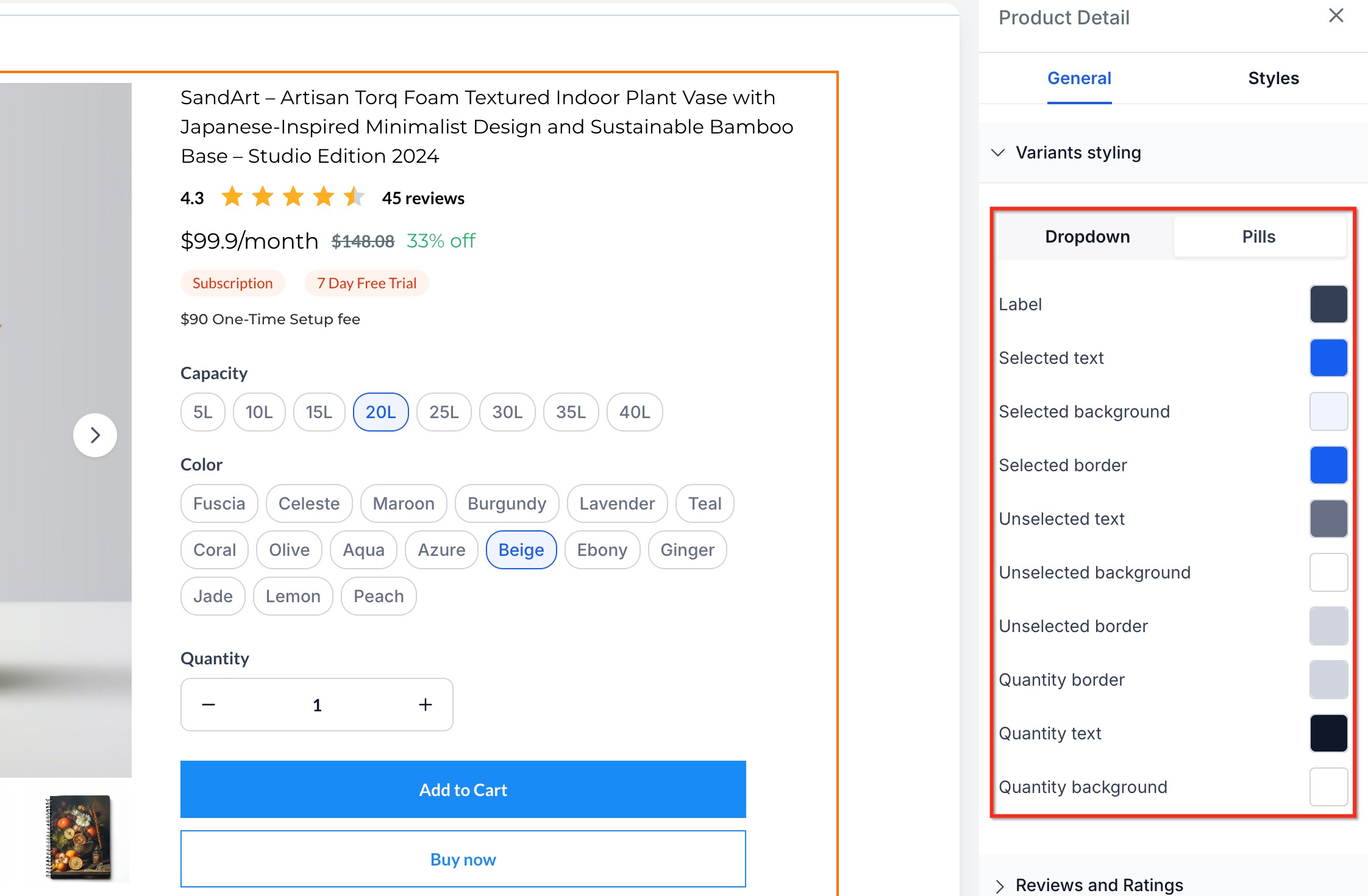
Pills Example
Pills expose available selections as buttons and can be useful when customers benefit from seeing all choices immediately.
Use Builder Preview to verify the selector layout, variant choices, pricing options, quantity controls, and overall page appearance. Review both desktop and mobile layouts when possible.
Save the builder changes and publish the page when the selector displays and behaves as expected.
- Dropdown remains the default variant display format for existing stores.
- Existing stores do not automatically switch to Pills.
- Pills display available variant choices directly on the Product Details Page.
- Pills support one selection per variant group.
- Quantity color customization is available when Pills is selected.
- Multi-price selectors follow the same Dropdown or Pills configuration used by variants.
Frequently Asked Questions
Need Help?
- Style option is missing: Confirm you are editing the Product Details Page and have selected the Product Details or Product element rather than another store element.
- Pills are not showing: Confirm Pills is selected under Variants styling and that the product has active variant or pricing choices to display.
- Quantity colors cannot be changed: Confirm the selector is using Pills, because quantity color customization is tied to that style.
- Wrong Product Details Page is changing: Check whether the affected product is mapped to a custom Product Details Page and edit that page if necessary.
- Builder and live page do not match: Save and publish the changes, then test the live page in a private browser window.
- Mobile layout looks different: Review the page in both desktop and mobile preview modes and adjust the surrounding layout if needed.
- Issue continues: Collect the affected product, Product Details Page, selected style, expected behavior, device/browser, and screenshots of both the builder settings and live page before contacting support.