
Gradient button backgrounds let you create modern, branded calls-to-action in Forms, Surveys, and Quizzes. Instead of relying only on a single solid color, you can apply gradient styles directly from the button settings. This gives you more design flexibility without needing custom CSS for standard gradient button styling.
TABLE OF CONTENTS
What is Gradient Button Background Styling?
Gradient button background styling allows you to apply a multi-color background effect to buttons in the Form, Survey, and Quiz Builder. Instead of using one flat color, you can blend two or more colors together using supported gradient types.
This helps you create buttons that better match your brand, landing page design, or campaign style. You can choose between a solid background and a gradient background, then customize the gradient type, colors, angle, and color stops directly from the builder.
Key Benefits of Gradient Button Background Styling
Gradient button backgrounds give you more control over how buttons appear across Forms, Surveys, and Quizzes. These styling options are useful when you want call-to-action buttons to stand out while keeping setup simple and code-free.
- More Visual Flexibility: Create button designs that feel more modern and dynamic than a single solid color.
- No Custom Code Required: Apply standard gradient button backgrounds directly from the button settings.
- Brand-Focused Design Control: Blend multiple brand colors together for a more customized look.
- Multiple Gradient Styles: Choose from linear, radial, and angular gradient types.
- Custom Color Blending: Add and edit multiple color stops to control how colors transition across the button.
- Existing Styles Remain Supported: Solid button background styles continue working, while gradient styling adds another design option.
Button Background Options
Button Background settings control whether a selected button uses a solid color or a gradient background. Choosing the right background type helps you match the button design to the purpose of your form, survey, or quiz.
You can choose between:
- Solid Color: Uses one background color for the button.
- Gradient: Uses multiple colors that blend together across the button.
Use a solid color when you want a clean, simple button style. Use a gradient when you want the button to feel more visually prominent or match a more dynamic page design.
Gradient Types
Gradient types determine how the colors blend across the button. Each type creates a different visual effect, giving you more control over the final button appearance.
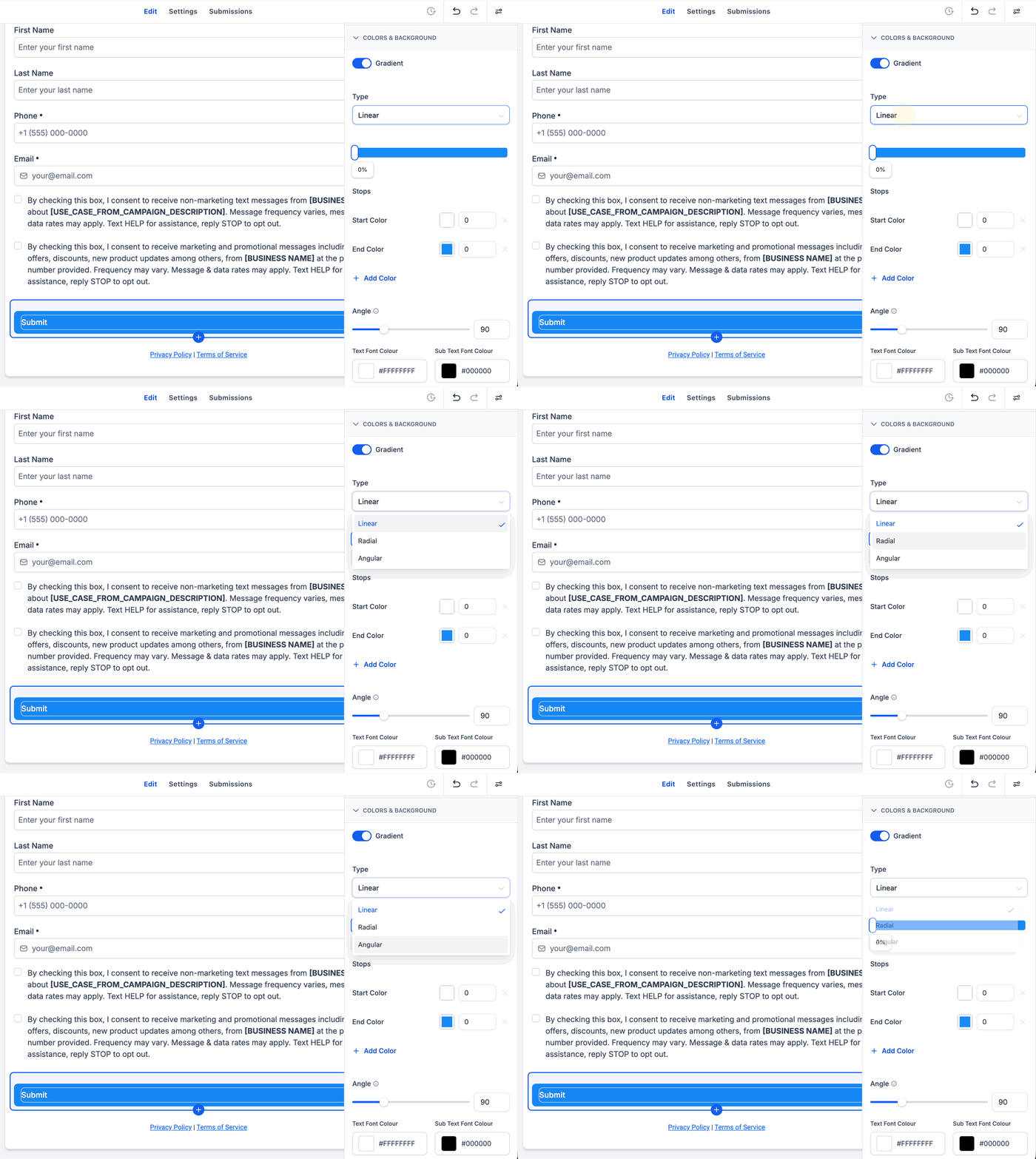
Supported gradient types include:
- Linear Gradient: Blends colors in a straight direction.
- Radial Gradient: Blends colors outward from a central point.
- Angular Gradient: Blends colors around an angle-based pattern.
Some gradient styles support angle adjustment, allowing you to change the direction or orientation of the gradient.
Gradient Angle
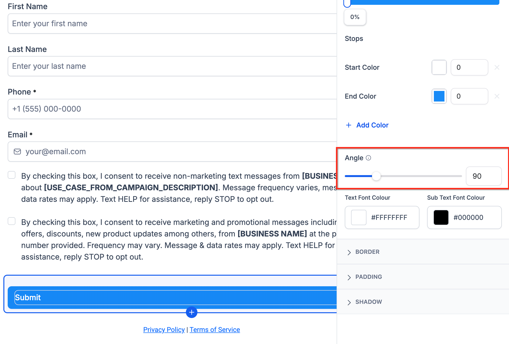
Gradient angle controls the direction of supported gradient styles. Adjusting the angle changes how the colors flow across the button, which can help the button better match the surrounding page design.
For example, a linear gradient may flow from left to right, top to bottom, or diagonally depending on the selected angle. If the selected gradient type supports angle adjustment, use the angle control to fine-tune the direction of the blend.
Color Stops
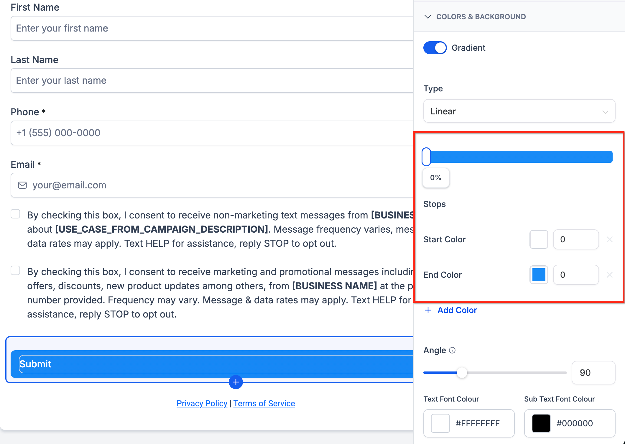
Color stops define the colors used in the gradient and where those colors appear in the blend. Adding multiple color stops gives you more control over how the gradient transitions from one color to another.
Use color stops to:
- Add two or more colors to the button background.
- Adjust how strongly each color appears.
- Create smoother or more customized transitions.
- Match brand color combinations more accurately.
How to Set Up Gradient Button Backgrounds
Proper setup helps ensure your button styling is applied to the correct element and matches the design of your form, survey, or quiz. Before making changes, select the button you want to update so the builder displays the correct button style settings.
- Open the Form Builder, Survey Builder, or Quiz Builder.
- Select the button element you want to customize.
- Open the button style settings.
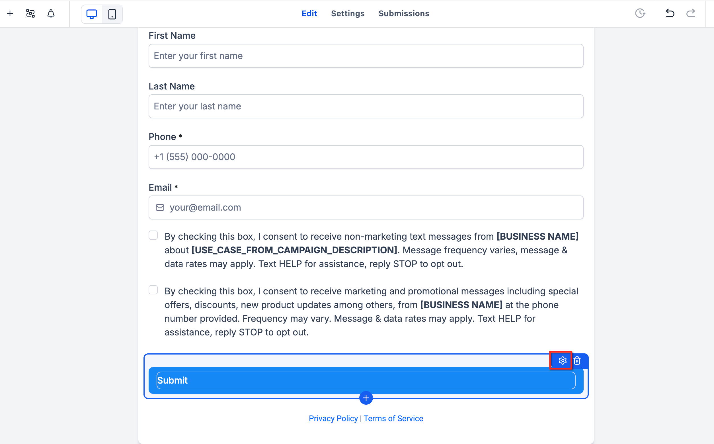
- Locate the Button Background section.
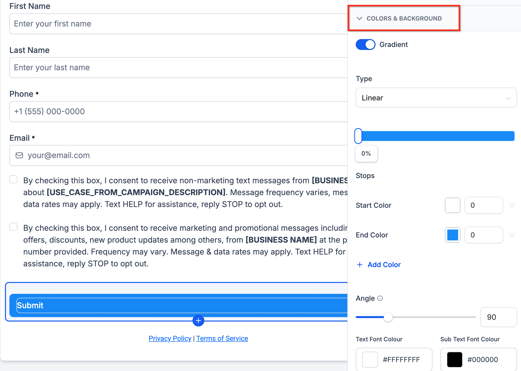
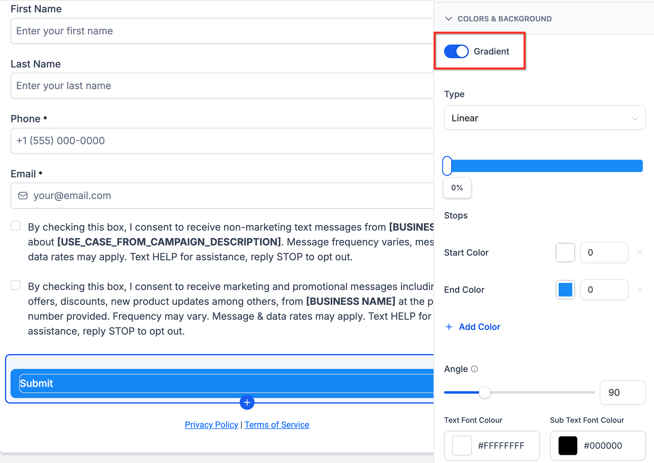
- Choose Gradient instead of Solid Color.
- Select the gradient type.
- Add or edit the gradient color stops.
- Adjust the gradient angle (if the selected gradient type supports angle customization).
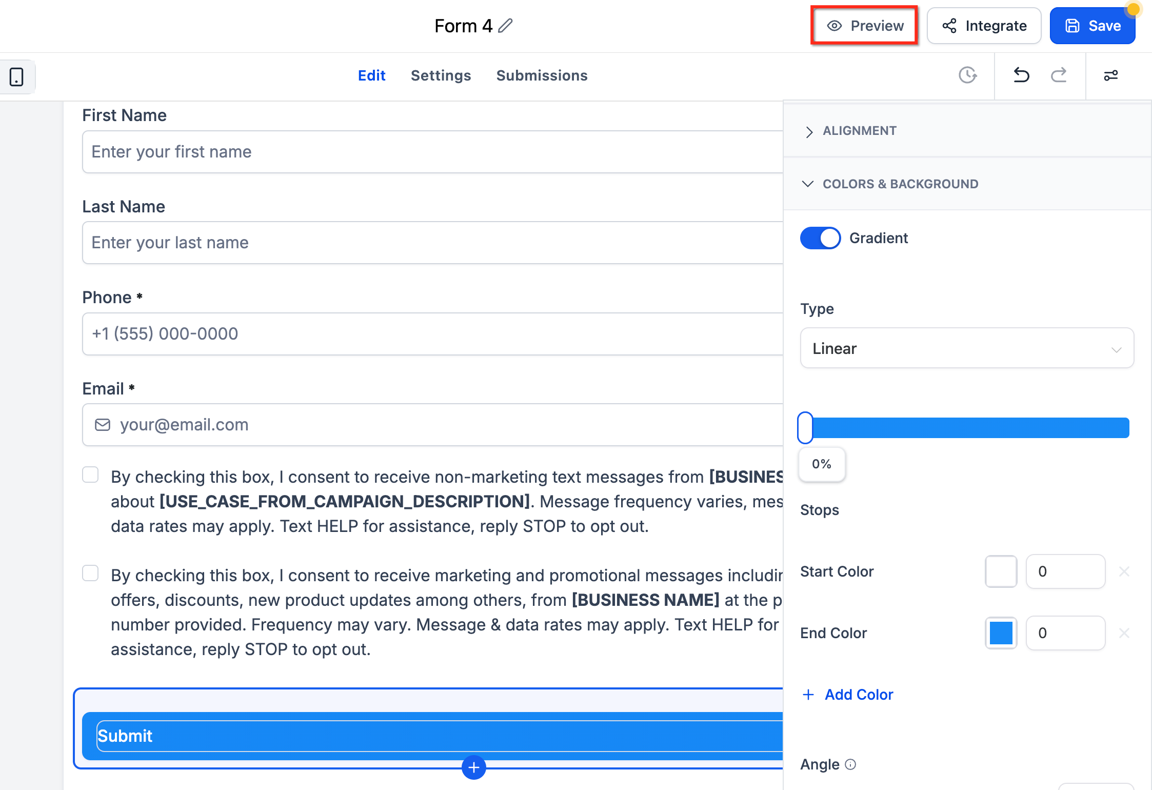
- Preview the form, survey, or quiz to confirm the button appears as expected.
- Save or publish your changes.
Frequently Asked Questions
Q: Can I still use a solid color for buttons?
A: Yes. You can choose between a solid color background and a gradient background.
Q: Which builders support gradient button backgrounds?
A: Gradient button backgrounds are supported in the Form Builder, Survey Builder, and Quiz Builder.
Q: Do I need custom CSS to create a gradient button background?
A: No. Standard gradient button backgrounds can be configured directly from the button settings. Custom CSS may still be useful for advanced styling needs that are not available through the built-in controls.
Q: Can I use more than two colors in a gradient?
A: Yes. You can add and edit multiple color stops for more customized button designs.
Q: Will this change existing button styles automatically?
A: No. Existing button styles continue working. You can manually switch a button from a solid background to a gradient background when you want to use the new styling option.