
Mobile formatting helps your emails stay readable and visually consistent on smaller screens. You can adjust supported headings, paragraphs, and buttons specifically for mobile devices without rebuilding the entire email. This guide explains how to configure mobile formatting, preview your design, and send a test email before publishing.
TABLE OF CONTENTS
- What Is Mobile Email Formatting?
- Key Benefits of Mobile Formatting
- What You Can Customize for Mobile
- How to Adjust Mobile Formatting
- How to Send a Test Email
- How to Preview Your Email
- Best Practices for Mobile-Friendly Emails
- Frequently Asked Questions
- Need Help?
What Is Mobile Email Formatting?
Mobile email formatting lets you apply supported design settings specifically to the mobile version of an email template. This is useful when text, spacing, or buttons that look good on a desktop screen need different formatting on a smaller device.
Mobile-specific formatting can help you control elements such as:
- Heading size
- Text alignment
- Line height
- Paragraph formatting
- Button formatting
Key Benefits of Mobile Formatting
Mobile formatting helps create a more consistent reading experience for recipients who open emails on phones or other smaller screens.
- Better readability: Adjust text size and spacing for smaller displays.
- Improved layout control: Apply mobile-specific alignment where needed.
- More usable buttons: Optimize supported button formatting for mobile interaction.
- Separate mobile styling: Customize supported mobile elements without changing the main desktop design.
- Easier testing: Preview and test the email before sending it to your audience.
What You Can Customize for Mobile
Mobile Formatting lets you enable separate styling for supported content types so you can improve readability and spacing on smaller screens.
Available options can include:
- Heading H1
- Heading H2
- Heading H3
- Paragraph
- Button
When a content type is enabled, additional mobile-specific controls become available. Depending on the selected element, these controls can include:
- Font Size: Controls how large the text appears.
- Text Align: Positions the text to the left, center, or right.
- Line Height: Controls the spacing between lines of text.
Only enable mobile-specific styling where an adjustment is needed. Elements that remain disabled continue using their existing template formatting.
How to Adjust Mobile Formatting
Configuring mobile styling helps ensure important text and actions remain easy to read and use on smaller screens.
Open the Appearance Settings
Open the email template or campaign you want to edit. Select the Appearance icon in the email editor.
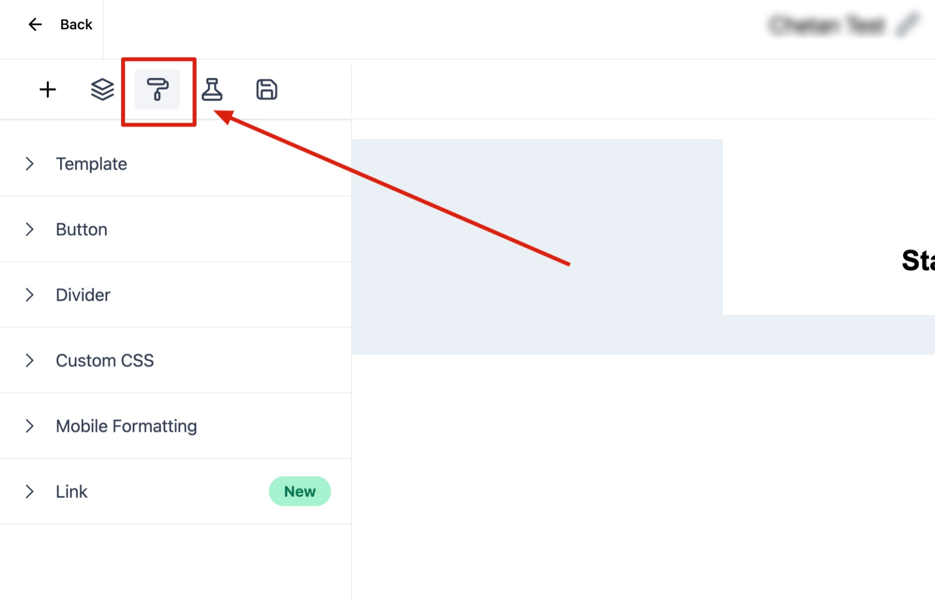
Select the appearance icon to open the template styling controls.
Open Mobile Formatting
Expand Mobile Formatting. The available mobile-specific content types will appear in the settings panel.
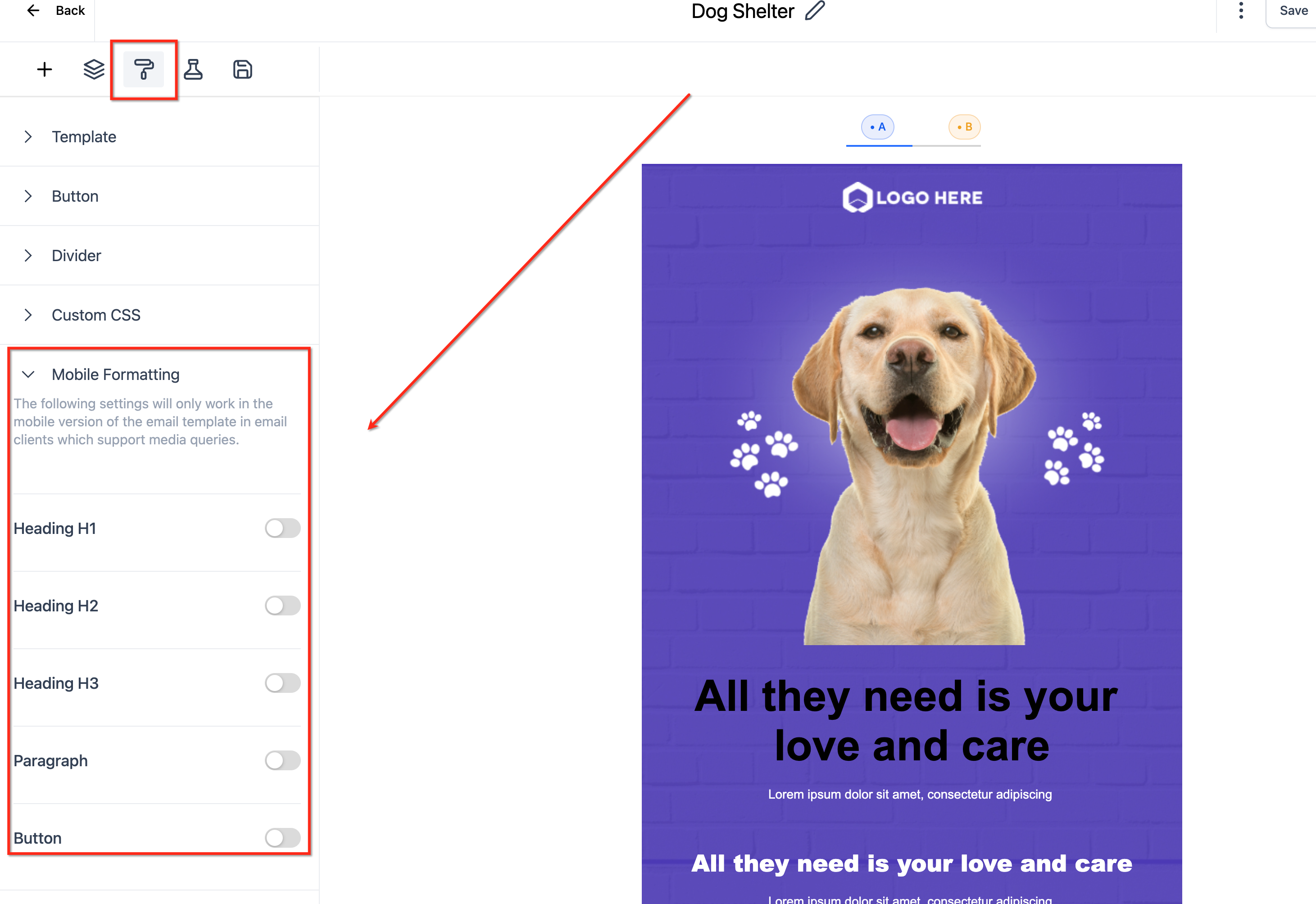
Expand Mobile Formatting, then enable the content types that need separate styling on mobile devices.
Configure the Mobile Styles
Turn on the toggle beside the element you want to customize, then adjust the available controls for that element.
For example, you may be able to change:
- Font Size: Adjust the size of the text on mobile screens.
- Text Align: Choose left, center, or right alignment.
- Line Height: Adjust the vertical spacing between lines of text.
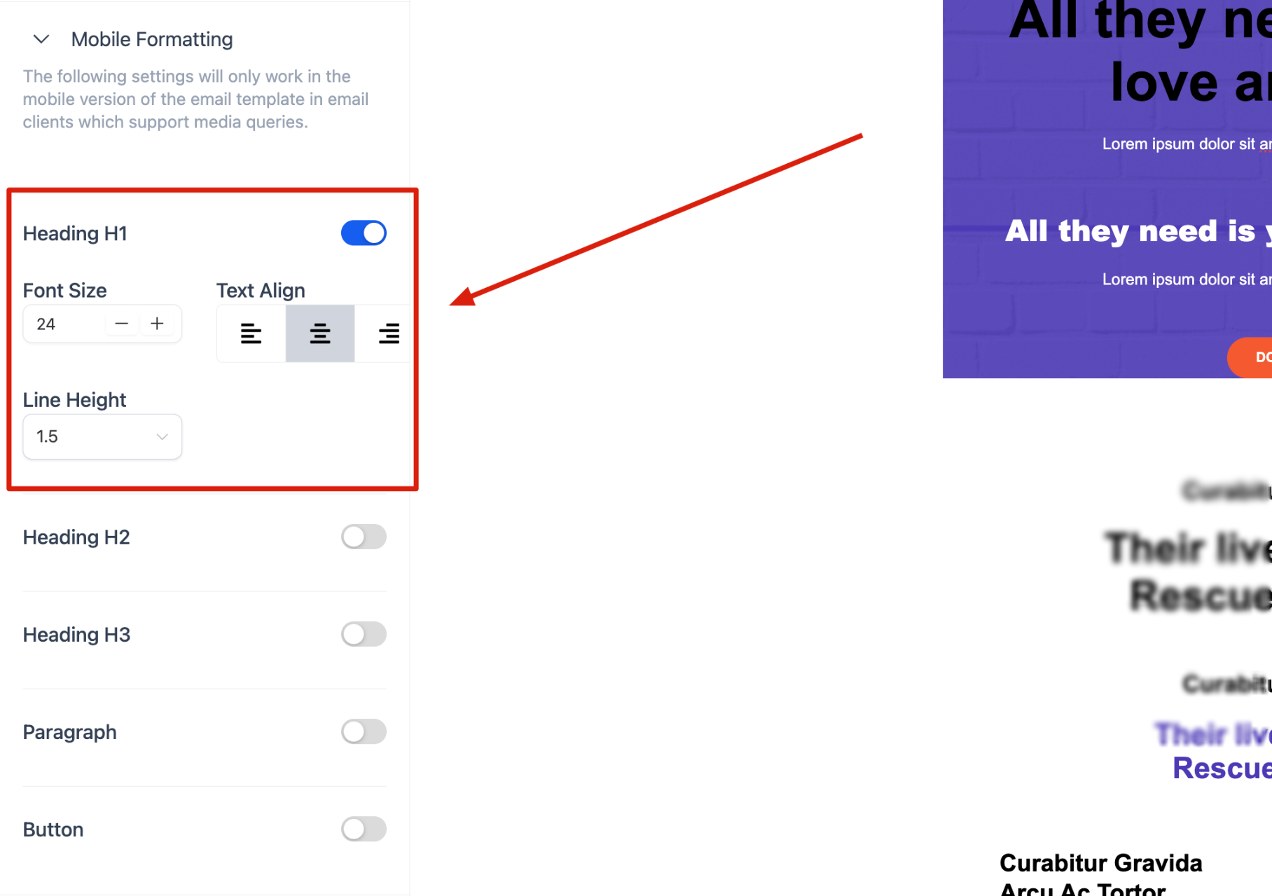
Enable the element you want to customize, then adjust its font size, alignment, and line height until the mobile layout is easy to read.
Save the template after completing your changes.
How to Send a Test Email
A test email lets you review the template inside an actual inbox and confirm how the content behaves on a real mobile device.
- Save the template.
- Open the three-dot menu near the top of the editor.
- Select Test Email.
- Send the test to an email address you can access.
- Open the message on a mobile device.
- Review text size, alignment, spacing, buttons, images, and overall layout.
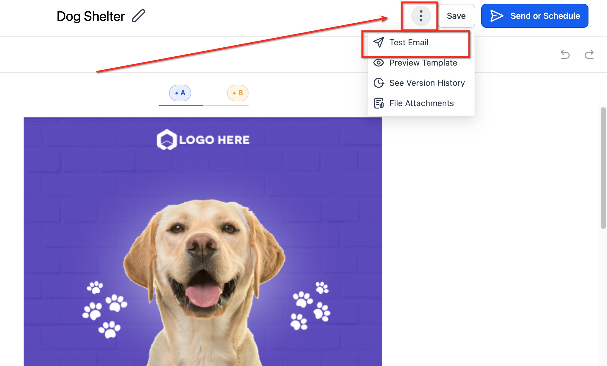
Open the additional options menu and select Test Email to send the template to an inbox for real-device testing.
How to Preview Your Email
Previewing helps you catch layout problems before sending the message to recipients. Use the preview to review the overall design, then use a test email to confirm how the message renders inside an inbox.
Open the three-dot menu, then select Preview Template.
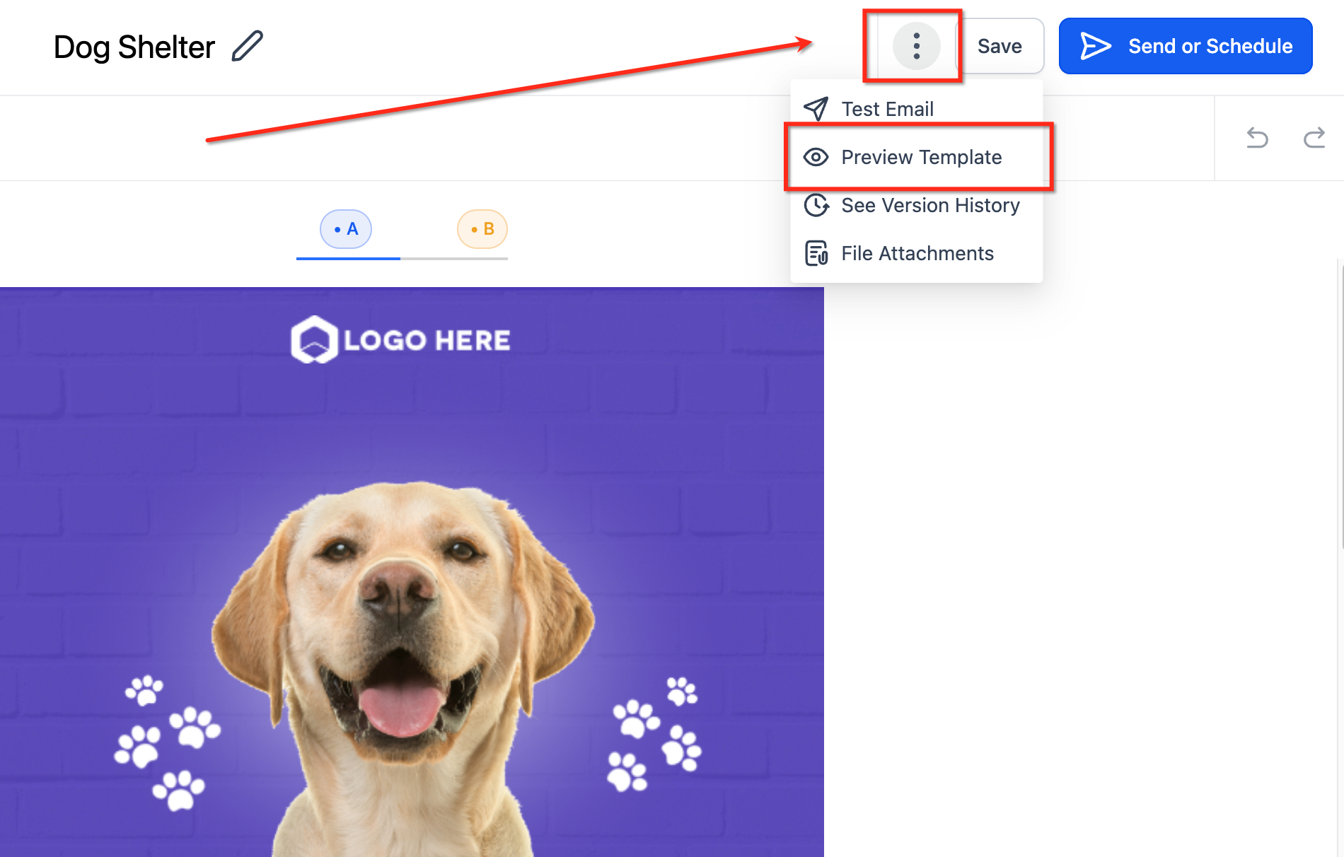
Select Preview Template to inspect the finished design before scheduling or sending the email.
Best Practices for Mobile-Friendly Emails
Simple layouts are generally easier to read and interact with on smaller screens. Reviewing mobile formatting before sending can help prevent oversized text, difficult-to-tap buttons, or crowded layouts.
- Keep headings short and easy to scan.
- Use readable font sizes.
- Avoid overly tight line spacing.
- Keep important buttons easy to tap.
- Avoid placing too much content in a single section.
- Use concise paragraphs.
- Check that images scale cleanly on smaller screens.
- Keep the most important information near the top of the email.
- Test links and buttons before sending.
- Review the email on both desktop and mobile devices.
Frequently Asked Questions
Q: Will mobile formatting change the desktop version of my email?
Mobile-specific settings are intended for the mobile version of supported email content. Desktop formatting remains based on the primary template design.
Q: Why do I need to enable the toggle beside a formatting option?
The toggle activates separate mobile styling for that content type. If it remains disabled, the element continues using its existing template formatting.
Q: Which content types can I customize for mobile?
Supported options can include H1, H2, H3, paragraphs, and buttons.
Q: Why does my mobile email look different in another email application?
Email applications can interpret responsive styling differently. Some may not support every mobile-specific formatting rule.
Q: Should I use Preview Template or Test Email?
Use both. Previewing provides a quick design check, while a test email shows how the template behaves inside an actual inbox.
Q: Do I need to test every email on a mobile device?
Testing is recommended whenever you make significant design or formatting changes, especially before sending an email to a large audience.
Need Help?
If the mobile version of your email does not look as expected, first review the Mobile Formatting settings and confirm that the correct elements are enabled.
Verify that:
- The appropriate mobile formatting toggle is enabled.
- Font size, alignment, and line height are configured correctly.
- The template was saved after the changes were made.
- The email was previewed after editing.
- A test email was sent after the latest changes.
- The issue was checked on more than one device or email application when possible.
- The recipient's email application supports responsive mobile styling.
If the issue continues, capture screenshots of the Mobile Formatting settings, the template preview, and the received test email before contacting support.